May 21, 2026 · org-chart, hr-tech, buyers-guide
Org chart software in 2026 — 7 things that actually matter
A buyer's guide to picking org-chart software, with the seven features that differentiate tools that get used from tools that get screenshotted once and abandoned.
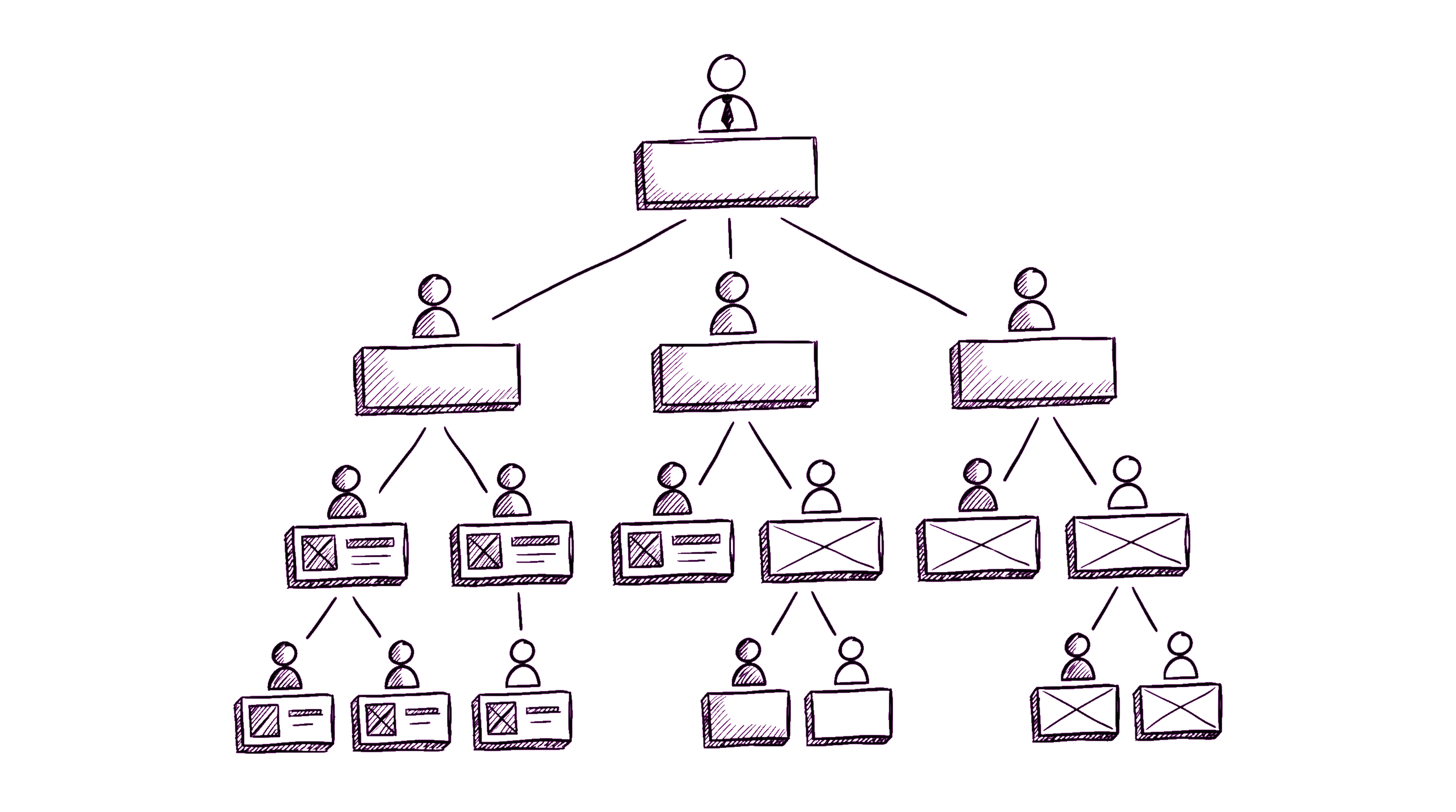
There are about thirty org-chart tools on the market. Most do the obvious thing: render boxes connected by lines, let you click a person to see their card, maybe export to PNG for slides. If that's all you need, every tool works.
But if you want the org chart to be live infrastructure — referenced daily, used to onboard new hires, source-of-truth during reorgs — the differentiating features are subtler. Here are the seven we look for.
1. The data source is the org chart, not an export of it
Bad pattern: org-chart software is a separate tool. HR pastes employee data into it monthly. The chart is always one month stale. Reorgs happen in a slide deck; the tool catches up later.
Good pattern: the org chart is the org structure. Updating someone's manager in the employee directory updates the chart instantly. There is no "publish" step. No staleness window.
Concretely: rule out any tool that requires you to "build" the chart separately from the employee list. The right tool generates the chart from a single source of truth.
2. Inline edits, not "open editor"
Reorgs are messy and iterative. A VP shuffles teams in a meeting; HR needs to model "what if Sarah's team merges with David's" without committing yet.
Look for: drag-and-drop on the live chart. Click a person, drag their card under a new manager, see the chart re-flow in place. Ideally with a draft/staging mode for big reorgs.
Rule out: tools that send you to a separate "edit" interface where you change one field at a time and re-render.
3. The chart fits on screen for your headcount
Demos always look great with 12 people. The real test is your actual headcount.
At 50 people, a top-down org chart still fits on a laptop screen with some zooming. At 200, it doesn't — you need a sensible default view (your team + neighbors, not the whole company) and decent zoom/pan controls. At 500+, you also need search-from-the-chart and breadcrumbs that show "you are here" in the tree.
Concrete tests: load your own company data into a free trial. Can you find a specific person in 5 seconds without already knowing their name? Can you collapse subtrees? Does the zoom-out view degrade to bands of color (useful) or to unreadable text (not useful)?
4. Vacancies + dotted lines
Real org structures aren't pure trees. The same person reports operationally to one manager and into a guild leader for craft mentorship. A team has 3 engineers and 1 open vacancy nobody has filled.
A serious tool models both:
- Dotted-line reporting: a secondary manager visible in the chart with a different line style.
- Open roles: a placeholder card with a "+ Vacancy" badge that recruiters can click through to the ATS entry.
Without these, the chart is aspirational ("here's what it would look like if we were fully staffed and reporting were always clean") rather than operational.
5. Stable URLs that survive reorgs
When you reference an employee in a Slack message, a wiki page, a meeting agenda — that reference should keep working after the next reorg. Stable URLs for both people (/employee/{stable-id}) and teams (/department/{stable-id}) are table stakes. URL slugs based on names or hierarchies break the moment someone gets promoted.
This is one of those things you don't notice when it works and curse for years when it doesn't. Verify before you buy: search for "permalink" or "stable URL" in the docs.
6. Mobile that's actually usable
Org charts on mobile are infamous for being miniaturized desktop views. The chart fits the width but every box is unreadable.
Better pattern: on mobile, the org tree degrades to a list with indented hierarchy rather than a graph. Easy to scroll, easy to tap into. The full graph view stays accessible behind a "View as chart" toggle.
Test: try to find a specific employee in your own org chart on your phone within 10 seconds. If you can't, expect the same from everyone else.
7. It surfaces context other tools miss
The differentiator between "yet another org chart" and "the chart we actually use" is the context you find on the employee page after clicking through.
Minimum useful set:
- Office + city + timezone (for "is this person around right now")
- Current absence status with return date ("on vacation until June 3")
- Manager + direct reports (1 hop in each direction)
- Tenure ("with us since 2024-03-12") — useful in reorg planning
- Skills or grade level (if you have a competency matrix)
- Contact info (email, Slack handle, phone if applicable)
Tools that show the name and title only are info-poor. Tools that show this much context turn the chart from "directory you reference" into "context you absorb."
What we'd skip
A few categories of feature that look great in demos but rarely justify their cost or complexity:
- AI-suggested reorgs. A model that proposes "optimal" team structures sounds futuristic; in practice, reorgs are politically and operationally constrained in ways the model doesn't know about. Plan reorgs in a doc.
- 3D visualizations. Pure novelty. Adds no information; harder to read; worse on mobile.
- Sentiment-coloring (the chart colored by employee survey scores). Combines two abstractions in a way that confuses both. Run the survey, share the survey results, don't color the org chart with them.
Where org charts fit in the bigger picture
Org charts are usually a feature of a broader employee portal or HRIS, not a standalone product worth buying. If you're at 50–200 people and shopping for a chart specifically, you'll likely save effort buying an employee portal that includes a good chart (and absences, directory, KB, basic reviews) for roughly the same price as a chart-only tool.
The pure-play org chart tools tend to make sense in two specific cases:
1. You're 500+ people and already have an HRIS, but its chart UI is unbearable. A bolt-on chart with a sync makes sense.
2. You're a consultancy that draws lots of speculative org charts for clients. Then a fast editor is the product.
Otherwise: chart-as-feature, not chart-as-product.