May 20, 2026 · office-map, hot-desking, hybrid-work
Office floor plans in your HR system — not just real-estate trivia
Why an office map inside the HR portal pays for itself in the first month after a return-to-office, a hot-desking shift, or a new joiner.
In every HR-software demo I've sat through, the "office floor plan" feature is the one customers smile at, then never bring up in negotiations. It looks like trivia: a nice-to-have on top of the directory and absences.
Then a customer goes hybrid, or hires a class of interns, or opens a second office, and the floor plan turns out to be the most-used feature of the portal in the next quarter. Here's why.
The three moments when floor plans pay off
Moment 1: a new joiner's first day.
The newhire's stack of first-day questions is mundane: where do I sit, where's the coffee, where is the restroom, where's my manager's office for our 1:1 at 11am. A floor plan with named seats answers all of those in 60 seconds, without bothering anyone, on the new joiner's own phone. The alternative is a building tour where they retain 30%.
Moment 2: hot-desking rollout.
Companies switching from assigned seats to hot-desking discover that the social fabric of who-sits-near-whom turns out to matter a lot. The floor plan gives both employees and managers a daily-update view: "who's in today, and where are they sitting." Without it, hot-desking becomes "an empty floor full of strangers who arrived early to grab the good desks."
Moment 3: opening a second office.
The first time you have two offices, the question "is Igor in Moscow or Belgrade this week?" goes from a Slack-DM to a daily friction. A multi-office floor plan with each employee's current office tag answers it ambiently.
What "good enough" looks like
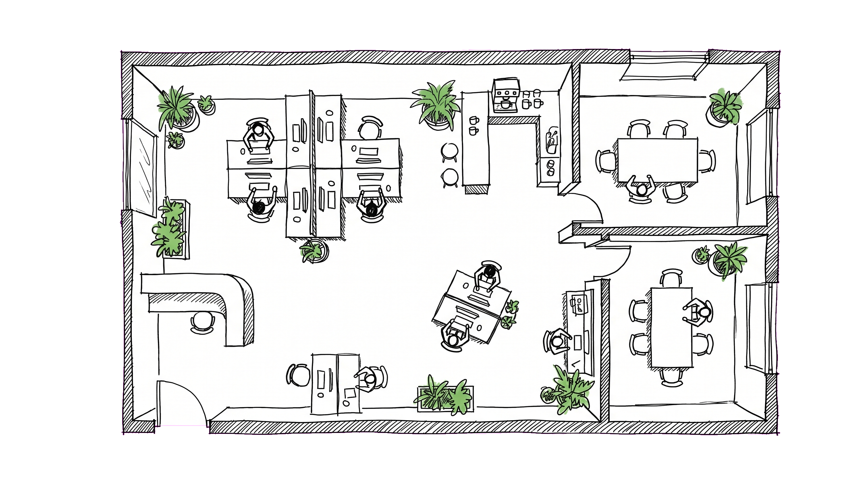
A floor plan feature doesn't need to be CAD-integrated to be useful. Here's the minimum that works:
- An image of the floor (architect drawing, PDF, or even a hand-drawn whiteboard photo).
- Clickable seat markers placed on top of the image, each tagged with a label (
R2-Desk-14) and optionally an employee. - Multiple floors per office, multiple offices per company.
- Mobile-friendly viewer — pinch-zoom, tap a seat to see who sits there, tap a person to navigate to their profile.
Anything beyond this (3D rendering, capacity heat-maps, real-time occupancy sensors) is usually overkill for the headcount where a portal makes sense at all.
What you do NOT need
A few things that get oversold:
- CAD integration. Architects use CAD; HR doesn't. The floor plan in your portal is a screenshot or PDF of the architect's drawing, not a live link. Avoid tools that require professional drawing software to update.
- Per-employee preferences. "I prefer a window seat" is a feature you'll regret immediately — it creates expectations, surfaces inequities, and gets gamed.
- Booking systems. Desk reservation is a separate problem. If you're at the headcount where you need formal desk bookings (rotating shifts, capacity caps, etc.), buy a dedicated tool (Robin, Envoy, etc.); don't expect your portal to do it.
Process matters more than the tool
Whichever tool you use, the failure mode is the same: nobody updates it. After three months, half the seats show the names of people who left, and a third of the actually-occupied seats are unlabeled. The map becomes "lies plus blank space" and people stop trusting it.
The fix is process, not tech:
1. One person owns the map. Office manager, EA, ops manager, somebody. The minute it becomes "shared responsibility" it becomes nobody's.
2. Update at joins and leaves. Onboarding checklist: assign a seat. Offboarding checklist: unassign it.
3. Quarterly sweep. Walk the floor. Anyone whose name on the map doesn't match the person at the desk → update.
4. Optional: weekly "self-assign" nudge for hot-desking shops. Slack reminder Monday morning: "You haven't picked a desk for the week. [Pick one]."
Without this, the best UI in the world rots within a quarter.
When the floor plan should NOT exist
Two cases where a floor plan in your portal is a net negative:
Pure remote teams. Nobody benefits from a map of an office nobody visits. Building the placeholder ("Headquarters" with 4 desks for the founders who occasionally pop in) creates the false impression that there's a place new joiners should be familiar with.
Single small floor with assigned seats that never change. If everyone has had the same desk for 3 years, the map is redundant with the directory.
The sweet spot is teams with 30+ in-office headcount, two or more rooms or floors, and any kind of mobility (interns, contractors, multi-office, hot-desking, occasional desk swaps for projects).
What we put in DTPulse
If you're curious how this manifests in our product specifically: our floor-plan feature is an SVG/PNG image you upload per floor, with clickable seat markers placed via a drag-and-drop admin tool. Each seat can be assigned to an employee, optionally labeled, and clicked through to the employee's profile. Multiple floors per office, multiple offices per company, mobile-friendly viewer. No CAD, no booking system. Boring by design — exactly the level of feature that actually gets used.